Microsoft UXperiences
From foundational brand narratives to advanced interface systems, I led strategic storytelling and end-to-end UX design for Microsoft's AI Standard, and for Microsoft Viva, the suite of interconnected employee experience products.
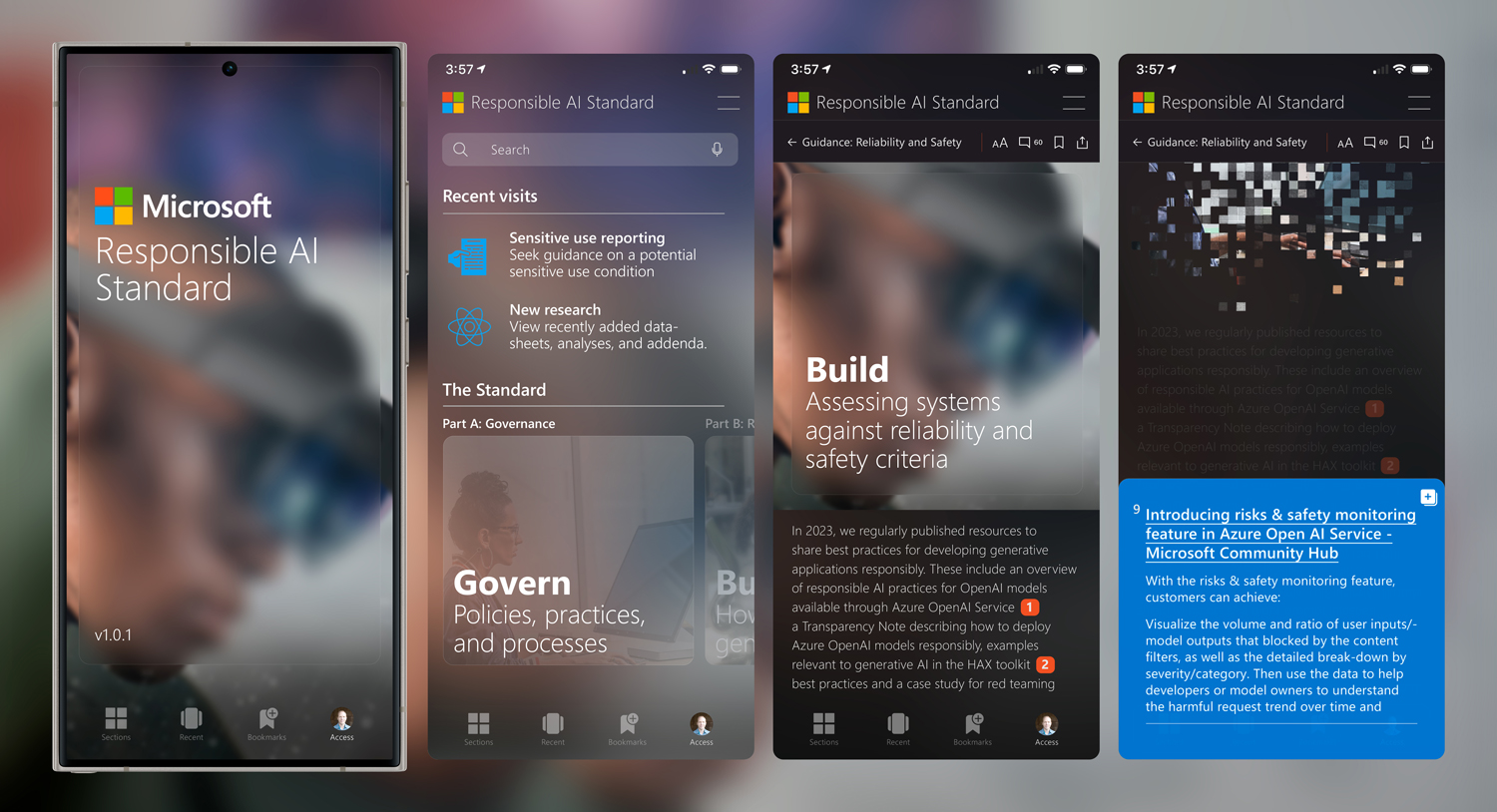
Accessible, Responsible AI
Designed an internal mobile app that made Microsoft's 200+ page Responsible AI Standard searchable, interactive, and actionable. The experience included in-app compliance testing, lifecycle documentation, and legal references—built to help engineers, researchers, and policy teams integrate responsible AI practices throughout the development process.
This project began with cross-functional discovery, where I led contributors from Legal, Ethics, Development, and senior leadership in stakeholder interviews and usability audits of existing documentation experiences to uncover pain points for engineers, legal reviewers, and ethics researchers. I directed the synthesis of findings into sets of user personas and journey maps, which guided the architecture of the tool and informed an iterative design process.
Working in close collaboration with engineering and policy teams, I led the creation of low-fidelity wireframes validating feature flow, followed by high-fidelity interactive prototypes. The design system prioritized WCAG 2.1 AA compliance, and a scalable information hierarchy that could adapt to future policy updates. The result was a modular experience that supported both quick reference and deep research, embedding ethical design practices directly into the development lifecycle.

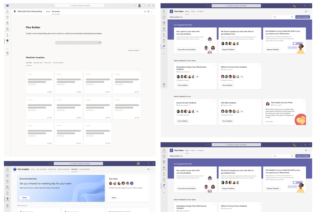
Microsoft Viva: Onboarding and Neighborhoods
Early-stage wireframe exploring the concept of a "neighborhood" view within Microsoft Viva. Designed in response to research highlighting the fragmentation of hybrid workforces, this feature modeled how employees could re-establish a sense of belonging and team cohesion through spatial, role-based, and interaction-based proximity.
Microsoft Viva: Modular Cards
A series of UX explorations testing modular "card" patterns to align with broader Microsoft design standards while improving scannability and content prioritization. Each card model was evaluated for its ability to support glanceable insights, contextual actions, and personalization within enterprise platforms.
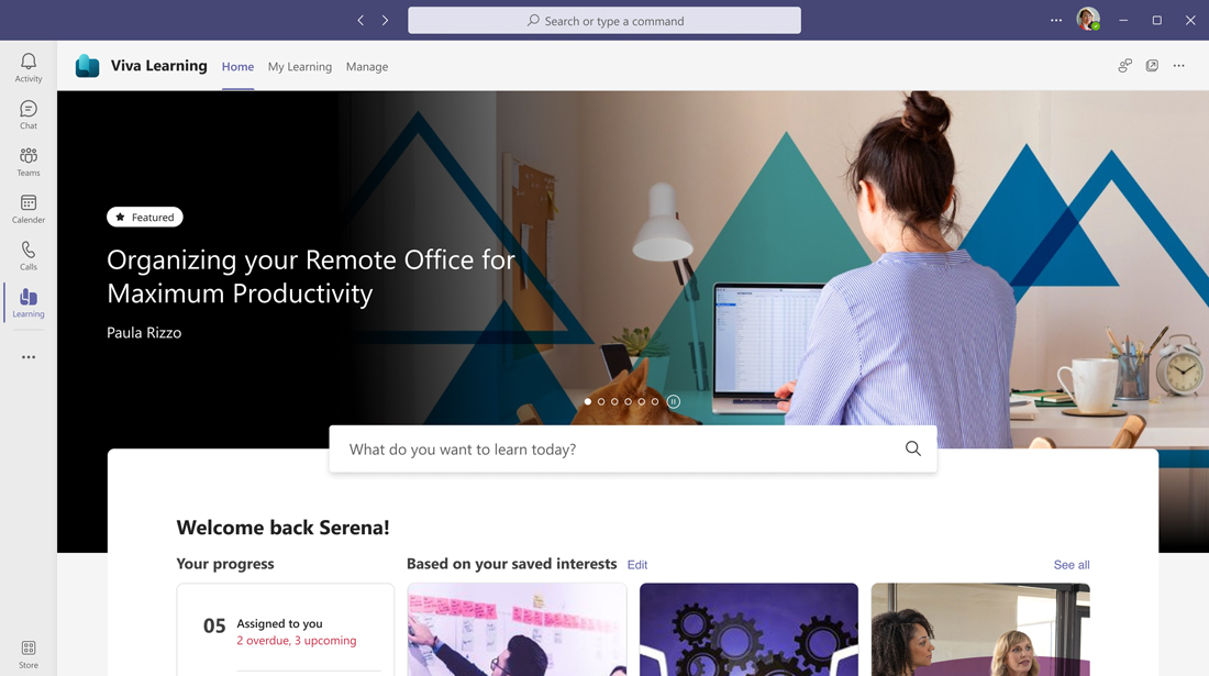
Microsoft Viva: Personalized Daily Hubs
Personalized homepage concept for Viva Learning, designed to surface timely, relevant information. The experience combines upcoming meetings, suggested content, and saved learning paths, reinforcing individual growth within the flow of work.
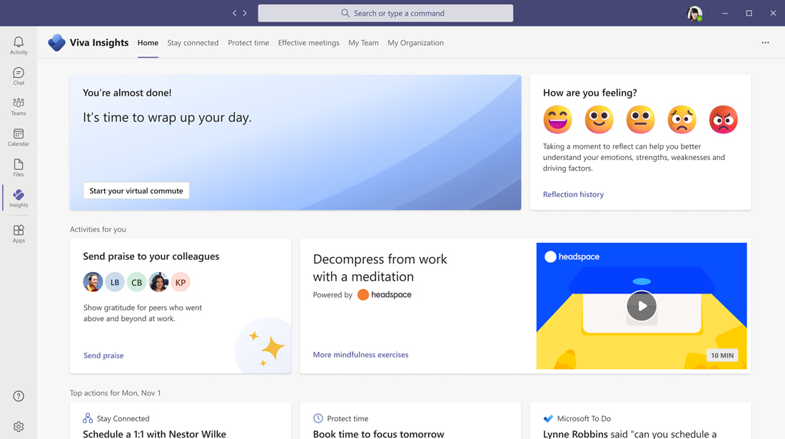
Microsoft Viva: Wellness-centered UX
UX view of Viva Insights prioritizing mental wellness and team connectivity. This screen foregrounds actions such as colleague recognition, meditation breaks, and manager check-ins—positioning wellness as a core, actionable design principle within enterprise UX.
Microsoft Viva: Brand Definition & Scriptwriting
Visual storyboards and concept sketches used to define the core narrative and emotional arc of the Microsoft Viva launch videos. These frames laid the foundation for scripting and voice development across campaigns, aligning brand storytelling with user journeys and product capabilities.
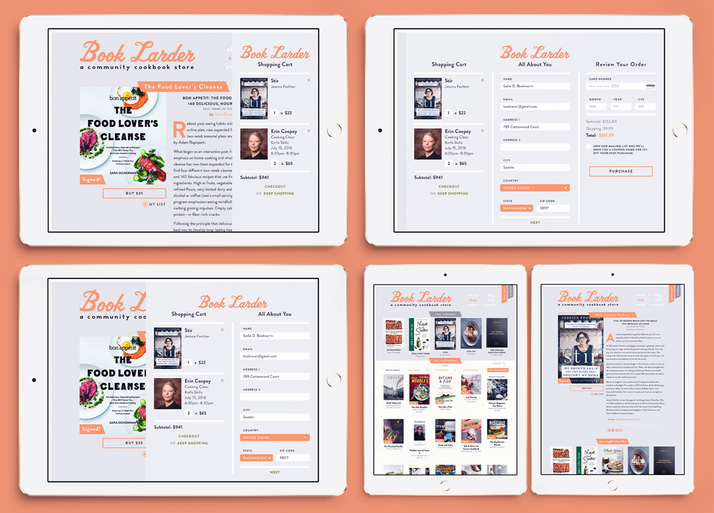
Book Larder
A fully custom e-commerce platform embodying the charm and thoughtfulness of the beloved Seattle culinary bookstore with a genuine "user experience." A focus on a forward-thinking, mobile-friendly checkout experience blended deep UX thinking with an extensible, elegant, deep design system, for a frictionless, best-in-class shopping journey.
Revolutionary off-canvas checkout design
An innovative off-canvas cart and payment gateway for Book Larder's pioneering e-commerce experience prioritized fluid navigation and minimal friction, setting a new standard for independent retail UX at the time.
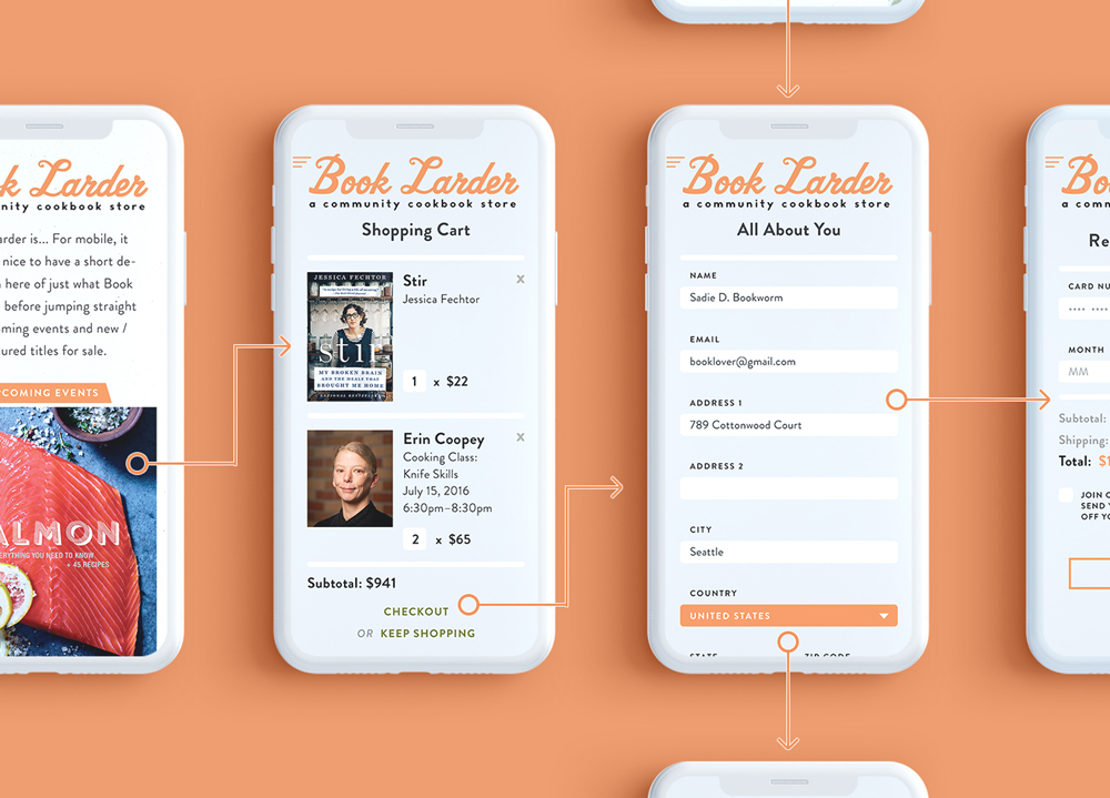
User flow mapping from product to purchase
High-fidelity journey mapping for Book Larder's e-commerce flow, illustrating a seamless progression from product detail to cart and checkout. This system was conceived, designed, and delivered end-to-end—spanning research, prototyping, interface design, and developer coordination.
Hawaiian Vanilla Co.
From brand identity to immersive e-commerce, this project for Hawaiian Vanilla Co. involved end-to-end design leadership across packaging, typography, storytelling, and a fully customized e-commerce experience. With over 200 SKUs and a rich family history behind the brand, the result is a site and system that sells with soul — and performs.
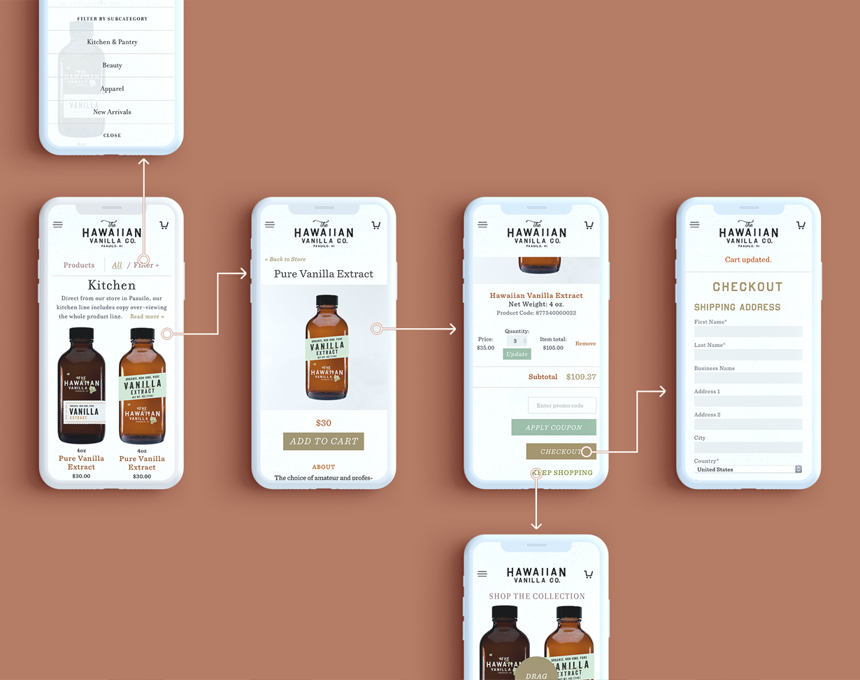
User journeys
A high-fidelity mobile experience tailored for browsing, discovery, and seamless checkout. From intuitive navigation to quantity selection UX, every screen was designed to bring artisanal charm and clarity to a 200+ SKU product line.
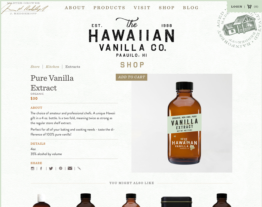
Product Details as Experiences
A richly detailed product page that tells the brand story while encouraging conversion. 'Signature' touches (like the founder's imprimatur) and shareable links elevate the experience and strengthen brand connection.
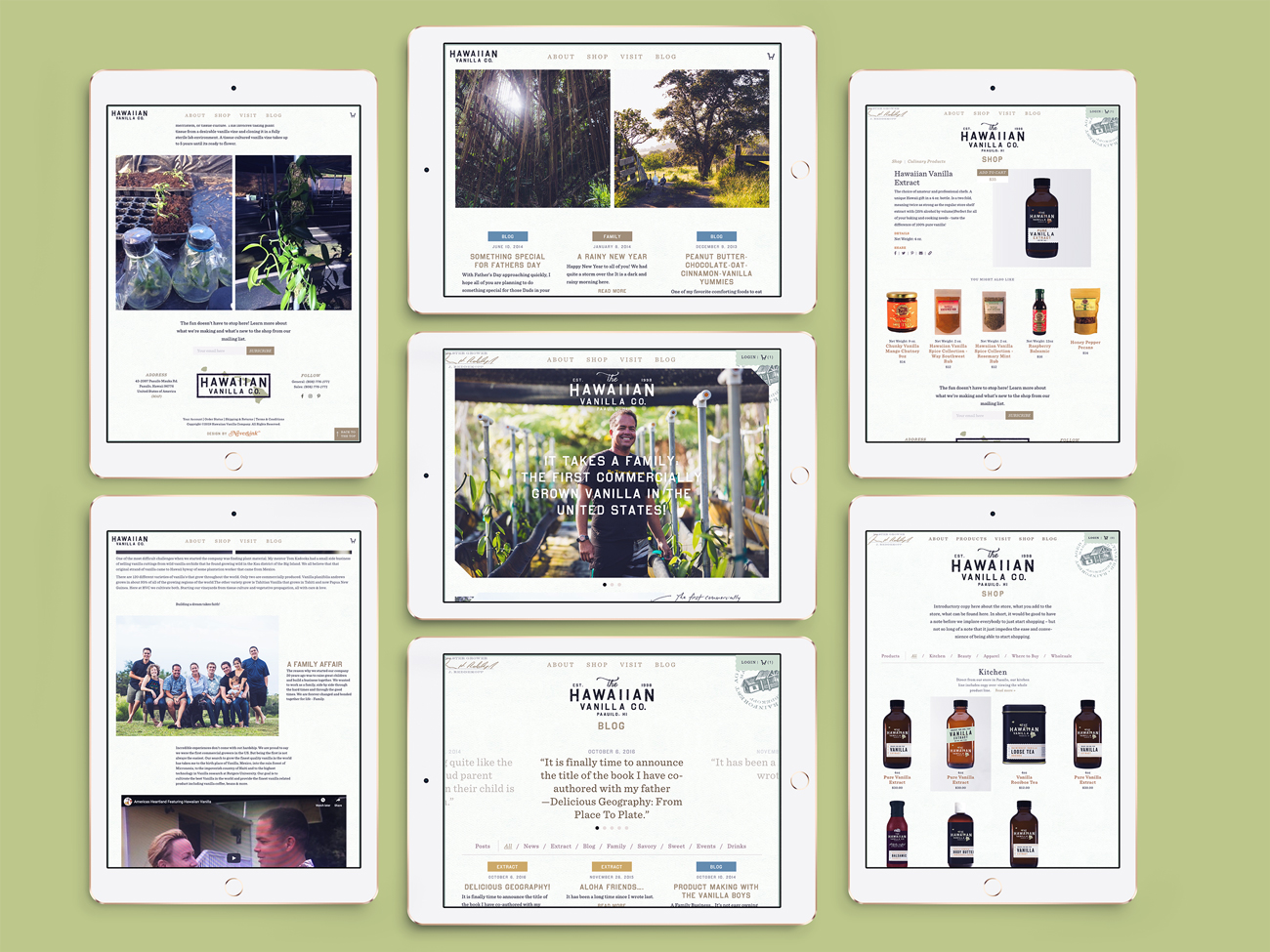
Sky-high detail
Custom photography and a handcrafted design system carry the brand through every interaction—from homepage to checkout. These six views demonstrate the strength of a unified digital and visual identity.

Sold overnight, worldwide
Beyond digital, the brand lives through packaging, type, and tactile storytelling. From a bespoke typeface to shelf-ready design, every element reinforces the product's hand-crafted origin and premium quality.
Dino's Tomato Pie
Dino's Tomato Pie went viral for its meticulously nostalgic, Geocities-style website—crafted in 1990s-era HTML with copy that blurred the line between parody and sincerity. The result was a joyful, intentionally lo-fi experience that earned over 20,000 daily visitors and transformed a neighborhood pizzeria into a digital cult favorite.

The Dino's Tomato Pie website was designed and coded as a loving homage to the early internet—with pixel fonts, table-based layouts, animated gifs, and intentionally janky HTML. Every word of copy was written for delight, resulting in a joyful and intentionally lo-fi experience that earned wide praise and massive traffic.