Marge Granola
Marge Granola's rebrand turned a farmers market favorite into a nationally distributed product beloved by press and consumers alike. I led brand design, packaging, and e-commerce strategy, crafting a joyful, tactile identity that drove investor acquisition and national retail success.
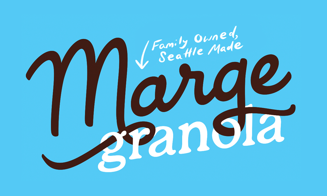
The Marge Granola logo was drawn entirely by hand to emphasize the crafted, human touch behind the product's origin story—a nod to the founder's heritage and a visual foundation for the brand's warmth and sincerity.
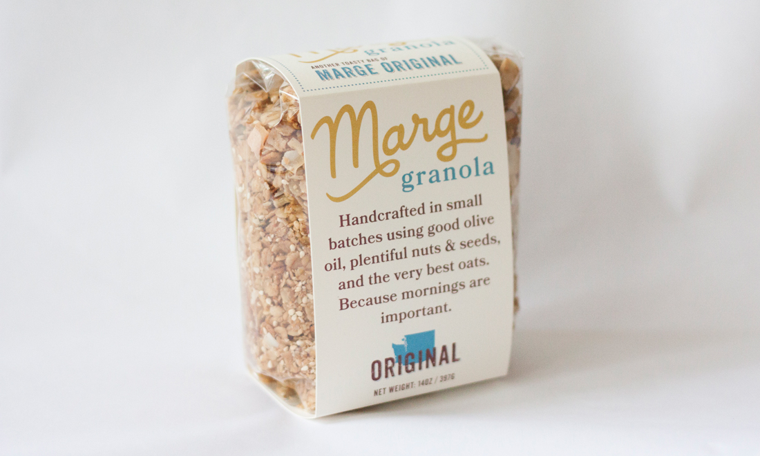
Our first retail packaging turned heads and drove early DTC sales. The signature wrapping label was designed evoked a huggable sense of comfort, while still revealing its quality ingredients.

As demand grew, I led a packaging redesign that introduced flexible, product lifespan-preserving pouches in vibrant, flavor-forward palettes, paving the way for scaled distribution while preserving the brand's joyful tone.

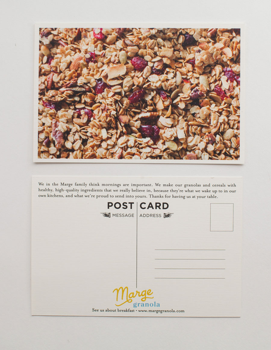
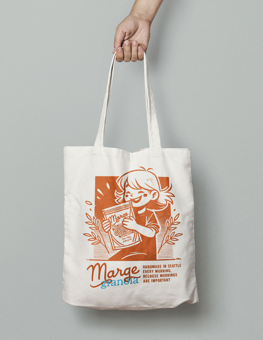
We expanded the product line to include individually wrapped granola bars, each designed to be unmistakably Marge: joyful, bold, and instantly craveable on the shelf or in the hand.

Microsoft AI
As one of the founding creative directors pushing Microsoft's entry into AI products, I helped establish a clear, cohesive brand identity that inspired belief, adoption, and alignment across engineering, legal, and product teams. From comprehensive editorial systems to symbolic stage design, every element helped signal a new era of responsibility at the core of Microsoft's innovation culture.

The full set of Responsible AI Standards translated a 200+ page internal framework designed to unify Microsoft's legal, engineering, and ethical AI efforts under a single, well-structured visual and editorial system that would be citable.

Interior spreads of the Responsible AI Standard feature a balance of typographic rigor, human-centered diagrams, and custom editorial illustrations to make complex legal and engineering content accessible and credible.

Custom lanyard designs for Microsoft Ready events visually interpret cascading policies flowing into action, reinforcing the program's theme of structured accountability.
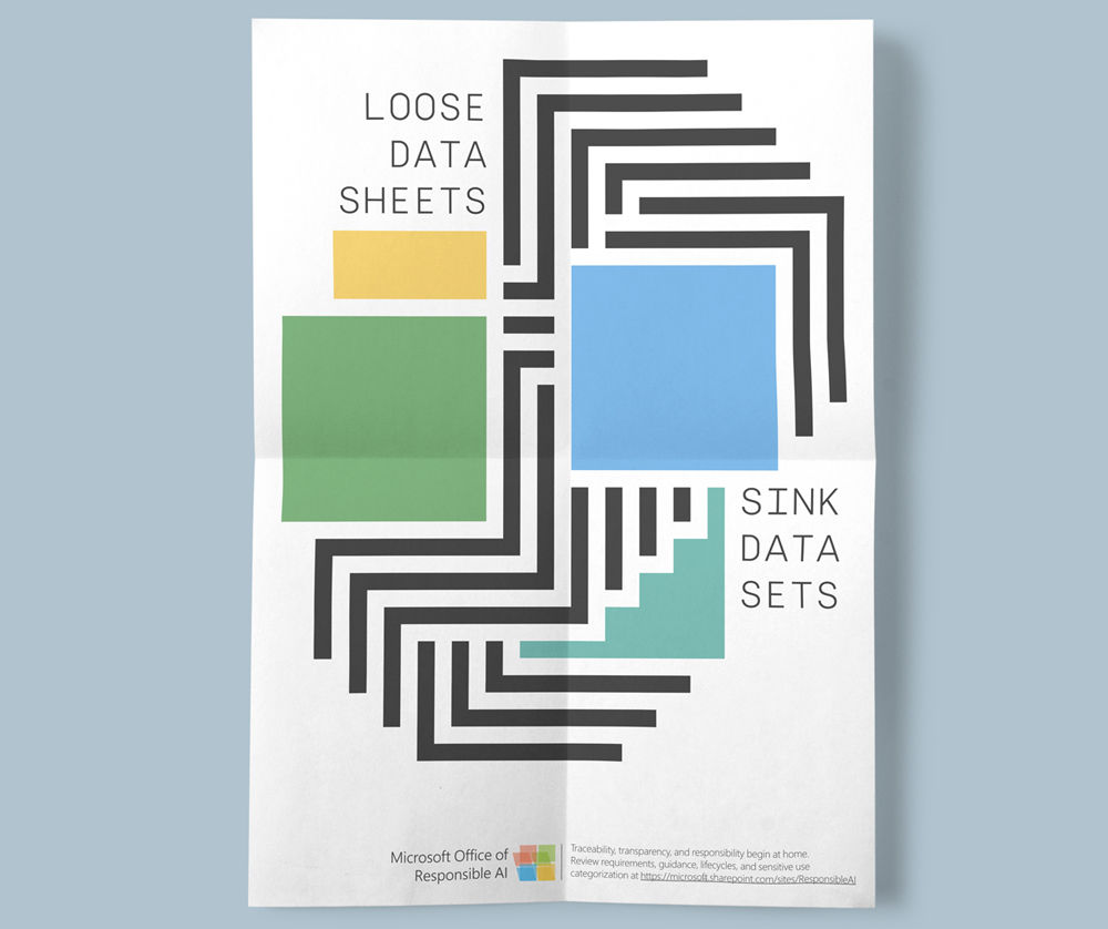
An internal campaign poster designed to provoke thought and spark curiosity among developers, reinforcing the cultural shift toward more mindful AI practices.
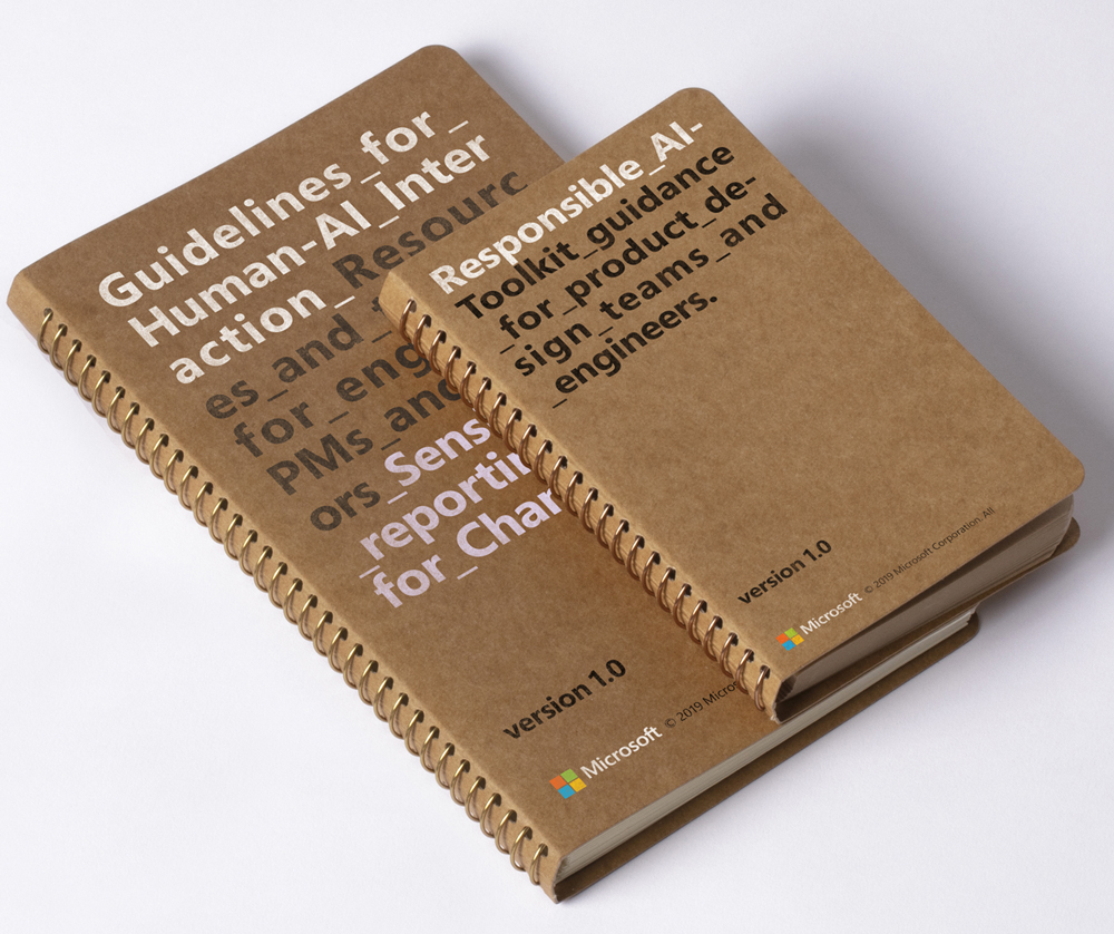
Notebooks created for internal Microsoft's engineering "Champions" were designed to foster conversation, offer delight in a medium for which none would be expected, and inspire ongoing commitment to ethical development practices.

The dawn of a new era at Microsoft: This core campaign image defined the Responsible AI narrative internally—combining strategic copywriting and symbolic design to signal the organization's future-facing intent.

The stage environment for Microsoft's internal Responsible AI summit subtly referenced command-line interfaces, tying design language back to developer tools and daily workflows.
Jun Kombucha
As brand design lead, I shaped Jun Kombucha from concept to shelf, overseeing brand identity, packaging systems, and even product development for standout flavors like Salted Apple and Fennel Watermelon. The result was a line of bold, beautiful cans that unified premium photography, vibrant colorways, and distinctive typography into a design system as refreshing and unexpected as the kombucha itself.

The Jun Kombucha identity strikes a balance between elegance and approachability, with a hand-chiseled logotype and editorial language that humanizes the brand and introduces its flavor-forward personality.

Each flavor features bold photography of a core ingredient paired with rich color palettes and minimalist layouts to ensure immediate shelf recognition.
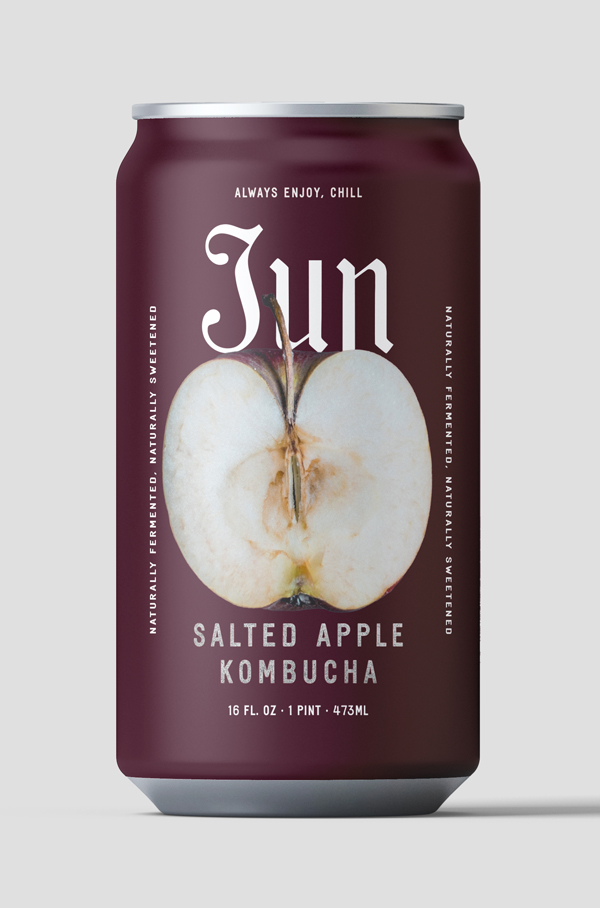
From the rich, wine-dark tones of Salted Apple...
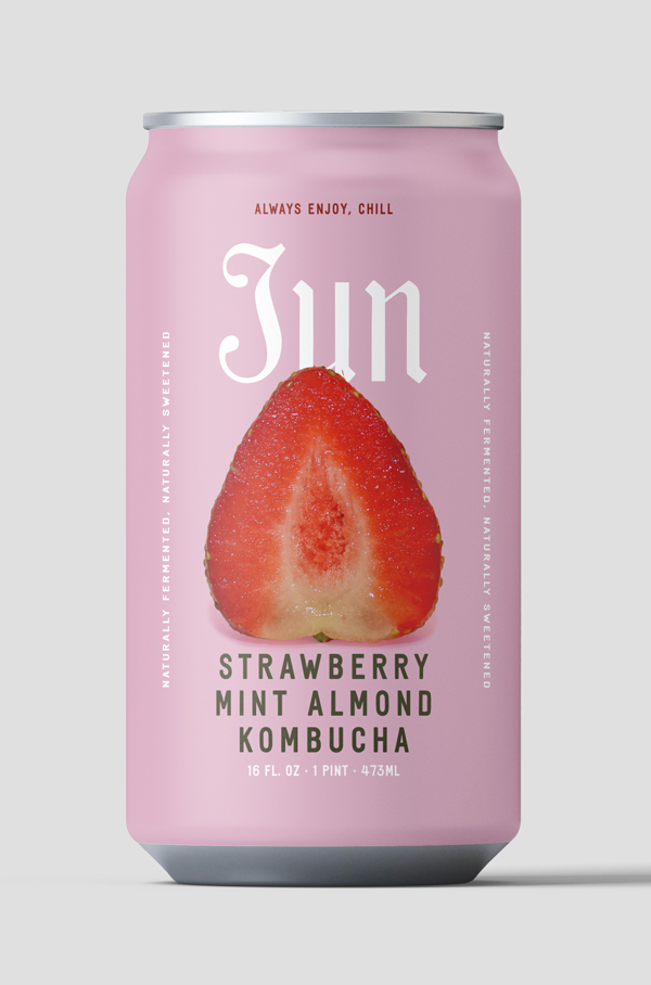
to the visually refreshing colors and succulent Strawberry Mint, to...
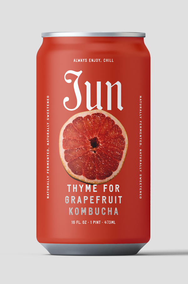
Thyme for Grapefruit

The packaging design highlights the design system's and the product line's depth: From typography and hue-perfect color consistency, to clear ingredient stories and custom voice-driven content, they allow for immediate brand affinity and recognition.
Campaign Zero
As design lead for Campaign Zero's Off the Books initiative, I created a bold visual identity and scalable design system for a high-stakes campaign to repeal harmful loitering laws disproportionately affecting Black, brown, unhoused, and LGBTQ+ communities. The project spanned landing page design, program branding, publication design, and social advocacy media—balancing moral urgency with credibility to influence both public opinion and policy change.

The Off the Books homepage centers on a dynamic hero graphic merging street-grid realism with national urgency, featuring a heat map of loitering-related incidents overlaid with humanizing capsule portraits.
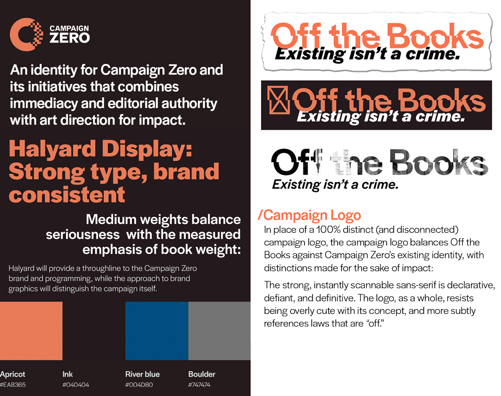
Typography and logo standards were designed to convey seriousness and immediacy, with bold letterforms and offset logomarks that visually underscore the idea of laws that are "off."
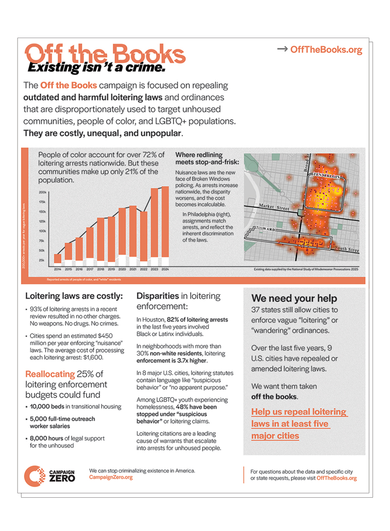
This concise one-sheet distills the campaign's mission, legal justification, and data for easy distribution to legislators and advocacy partners, balancing clarity, trust, and impact.
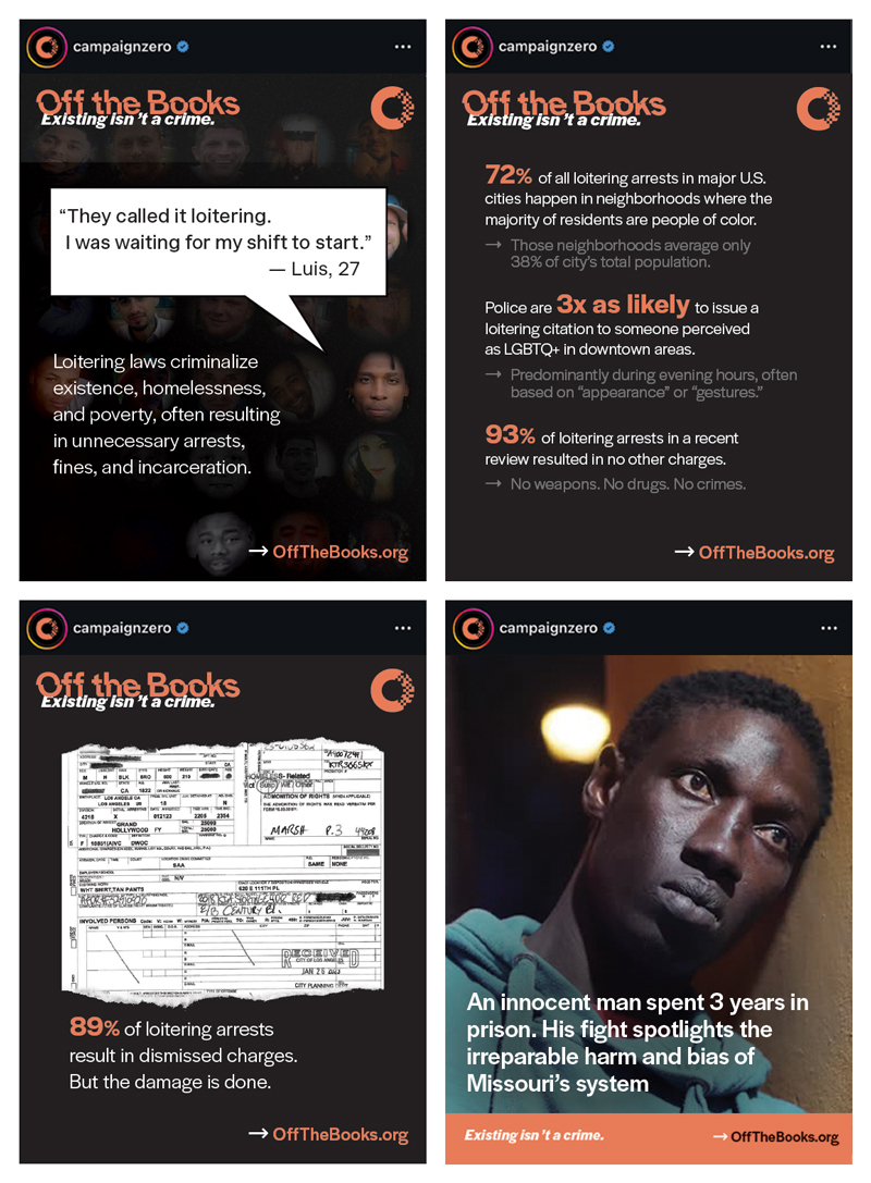
A cohesive set of social graphics uses data, portraiture, and sharp typographic rhythm to tell human-centered stories that resonate across platforms and communities.
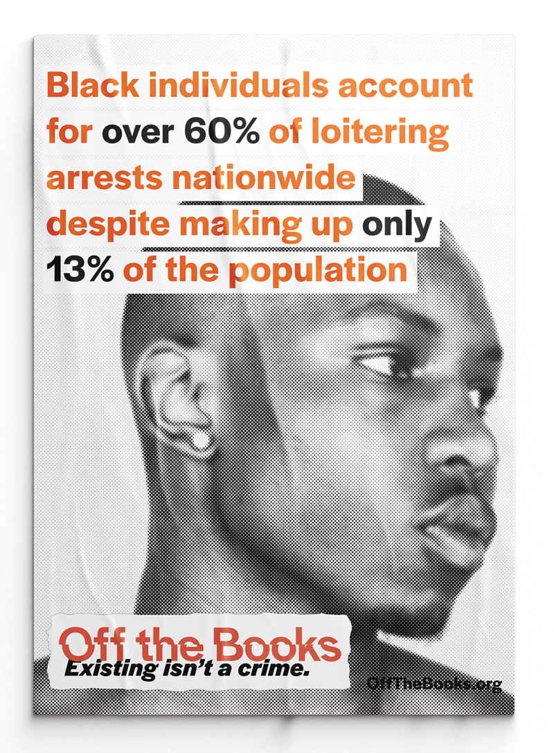
This stark poster juxtaposes an unsettling arrest statistic with a stylized but humanizing photography to provoke reflection and action among internal and public audiences.
Rising Tide
Revitalizing the visual identity of a struggling brewery, in an ever-changing landscape, with can designs that balance storytelling, retail impact, and legacy. Each release helped bridge the brewery's past with a more design-forward future, earning standout shelf presence and renewed brand energy in a competitive market.
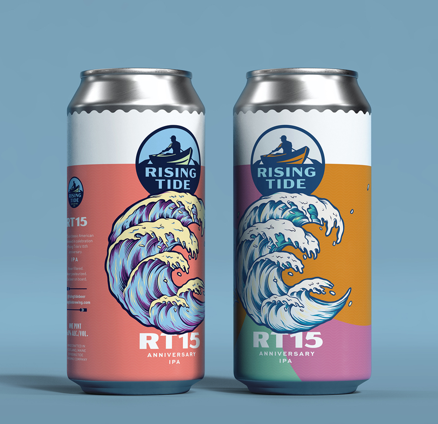
The design for a 15th anniversary commemorative can featured a Hokusai-inspired wave and metallic detailing, a nod to both Rising Tide's maritime roots and the layered craft of its brewing. The design helped reposition the brand as signficantly more art-forward and boldly contemporary.
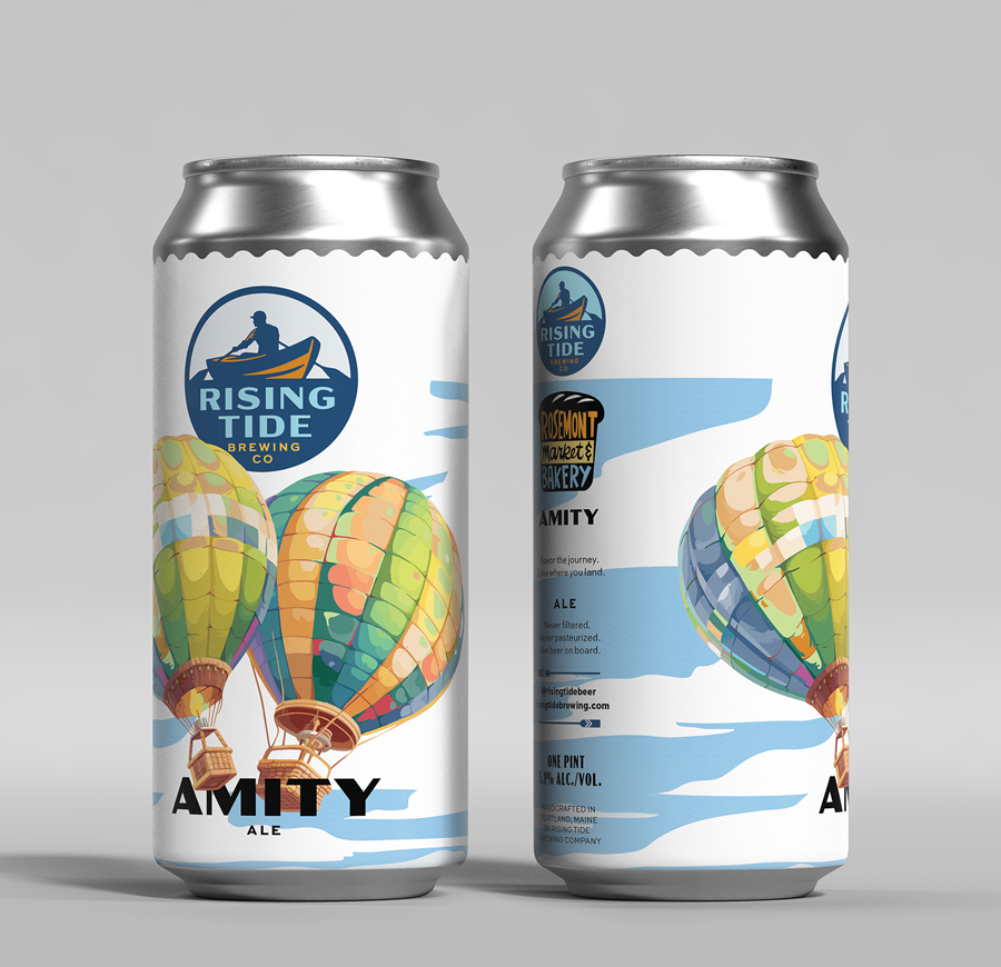
Designed for a limited collaboration with Rosemont Market, the Amity Ale can captures the spirit of friendship with a whimsical illustration of two hot air balloons meeting in mid-air, an image as joyful and unexpected as the beer itself. Instant local favorite.